
voclusive
Making an identity more legible
00

problem
When an organization does beneficial work in the community for over 15 years it deserves highlighting. Yet, despite the effectiveness of the educators and clinicians, “The Omaha School for Dyslexic Students” struggled with recognition. Long brand names are easily forgotten.
solution
IDENTIFYING POINTS OF DIFFERENTIATION Naming issues aside, the school struggled to compete among similar academic services, especially in a digital landscape. The previous system relied heavily on dated academic visuals as props (apple, pencil, etc.). Their team needed a more technology-forward solutions with immediate "punch."
LOGO AS "LIVING HIGHLIGHTER"
Dyslexic students learn to overlay different colored films to visually organize words.
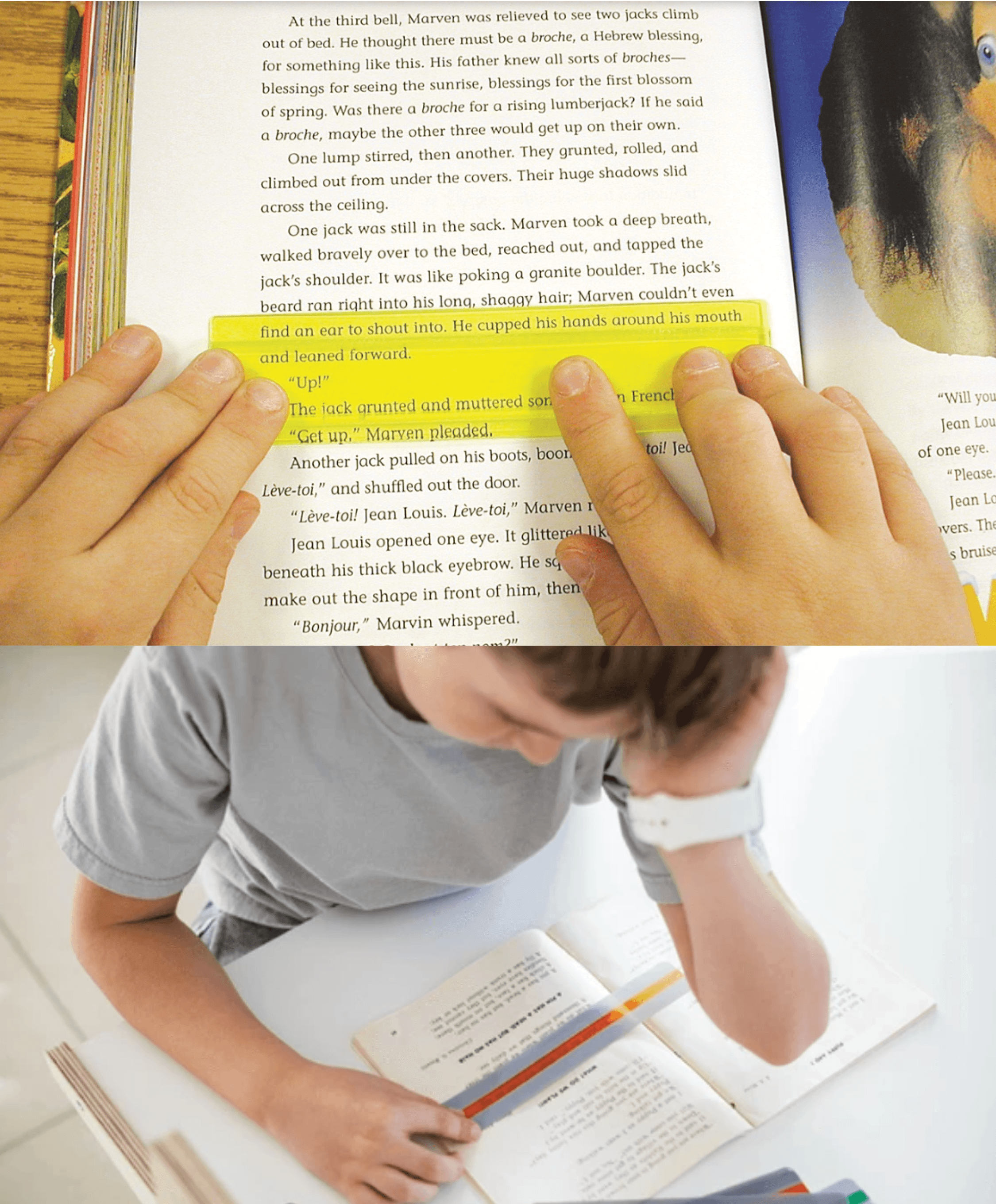
With this as inspiration, a responsive “box” was introduced, mimicking these colored overlays. This box doubles as “living highlighter” across the brand system, allowing the logo to expand as it sees fit across dense information.
THE SYSTEM OFFERS THREE CORE BENEFITS:
• Through the yellow box, the logo signals brand promise (reading comprehension)
• Internal creative staff gain design device to highlight key information
• Students can better comprehend brand touch points
year
2024
tools
Photoshop, Illustrator, Indesign
category
Nonprofit Branding
01

02

03
04


