
amber specialty pharmacy
Healthcare tech service branding
00

problem
Pharmaceutical manufacturers release highly-prized, limited release medications. Specialty pharmacies compete to obtain the rights to dispense these life-changing medications. Demonstrating to pharma that a specialty pharmacy has a differentiated service offering is critical and is often a deciding factor in competitions among near-identical pharmacies. Multiple departments and executive stakeholders pour over these pitch decks to ensure it meets the manufacturer's needs.
solution
Each logo shown here captures the uniue essence of the service line while employing key aspects of the parent brand, such as Gotham as the typeface or the gradient-rich pallete. Socializing each mark through the gauntlet of in-house approvals where highly analytical thinking is commonplace.
Design Details:
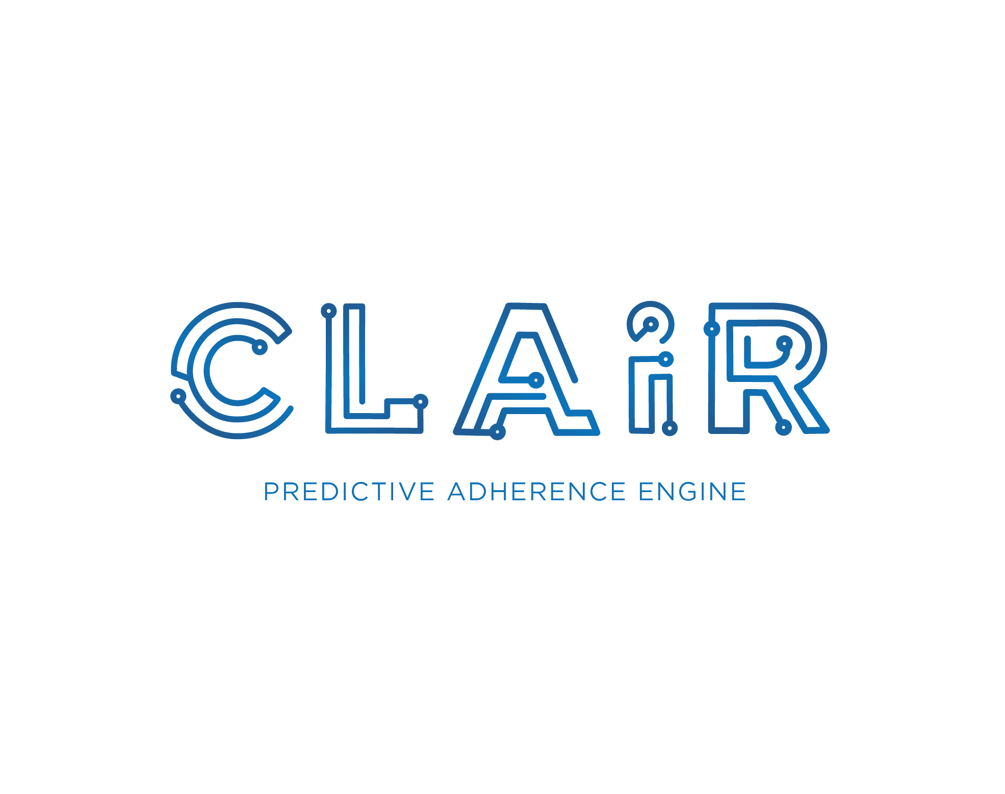
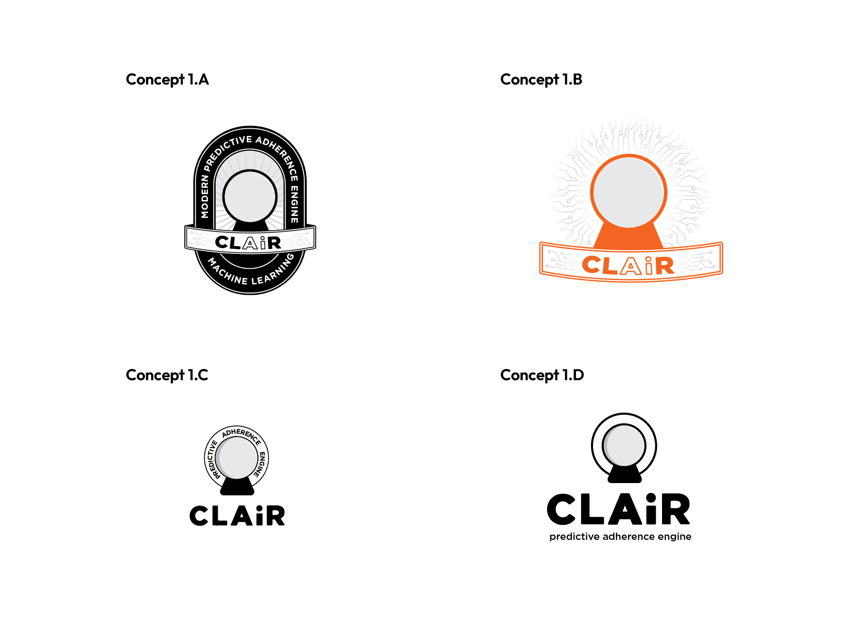
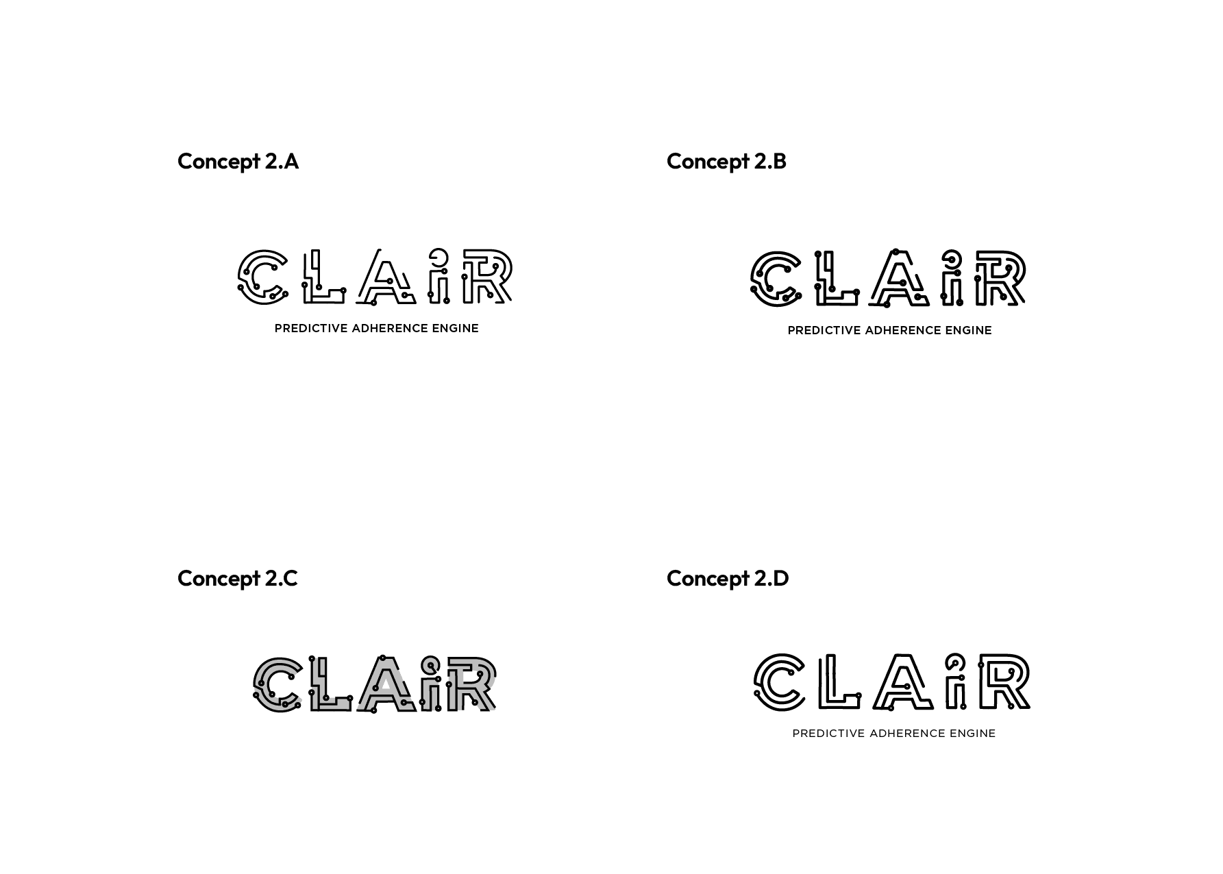
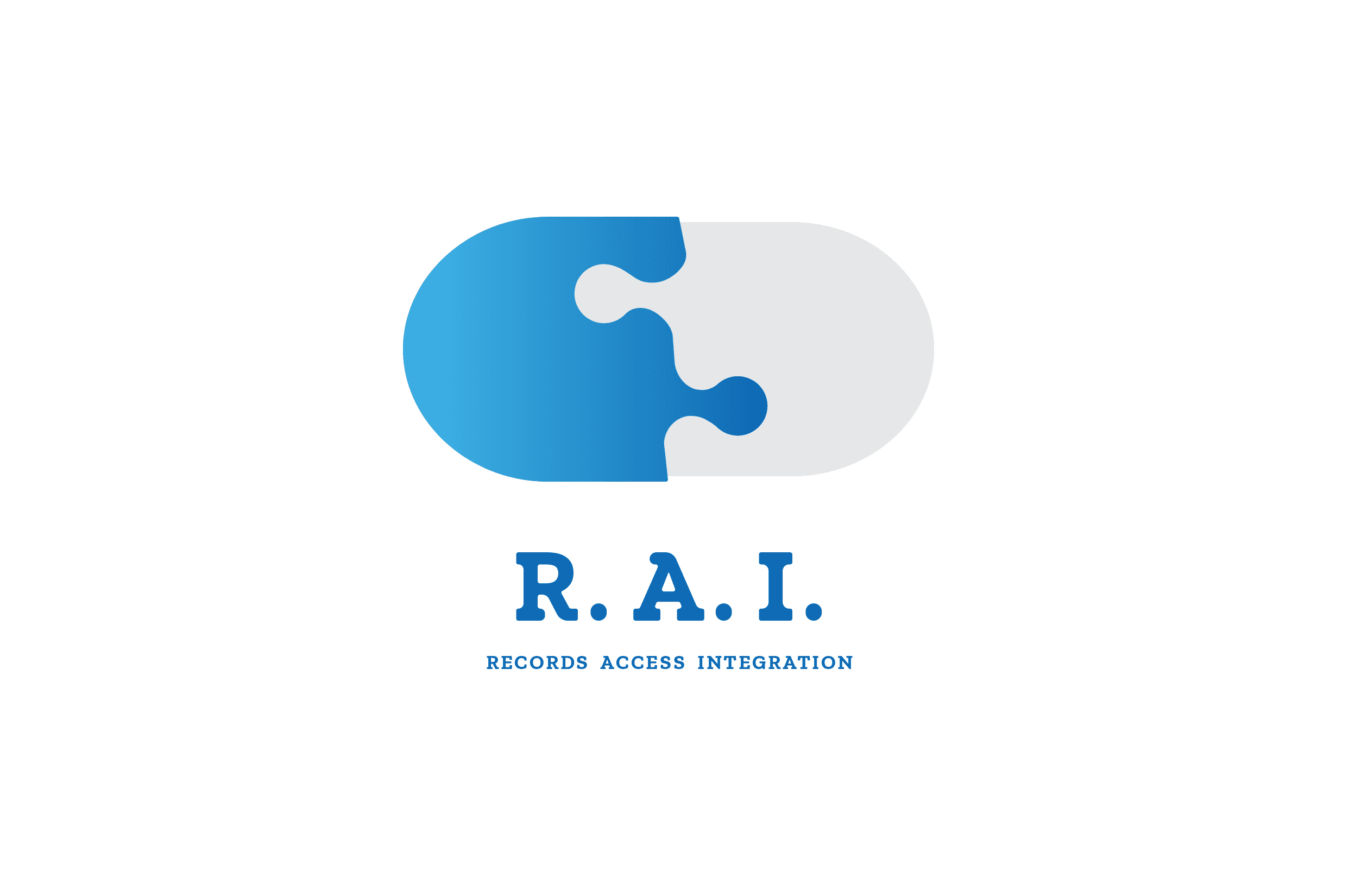
A circuitry motif was used to immediately signal "health-tech." The lines were also meant to balance the name (a shortened 'Clairvoyant'). The technology does predict when patients will lapse in their treatment, but we determined any concepts including imagery of crystal balls were over-indexing on the theme.
The eyes scan the mark eventually settling on the outlying "i" which awards the detail-oriented viewer with an understanding of the artificial intelligence theme.
In static assets, the subtle gradient offers an electric feeling that flat color applications weren't communicating.
Process Notes:
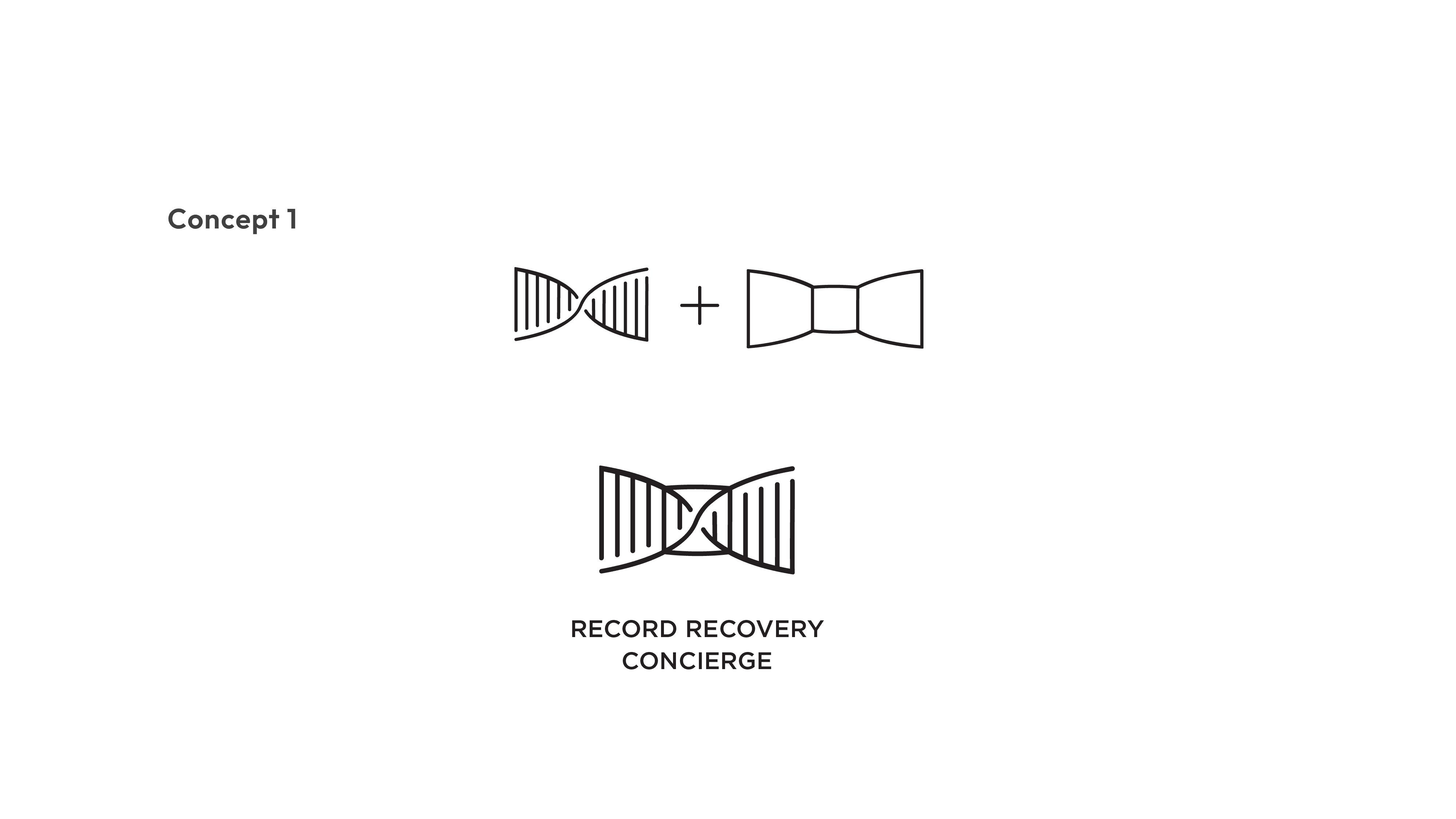
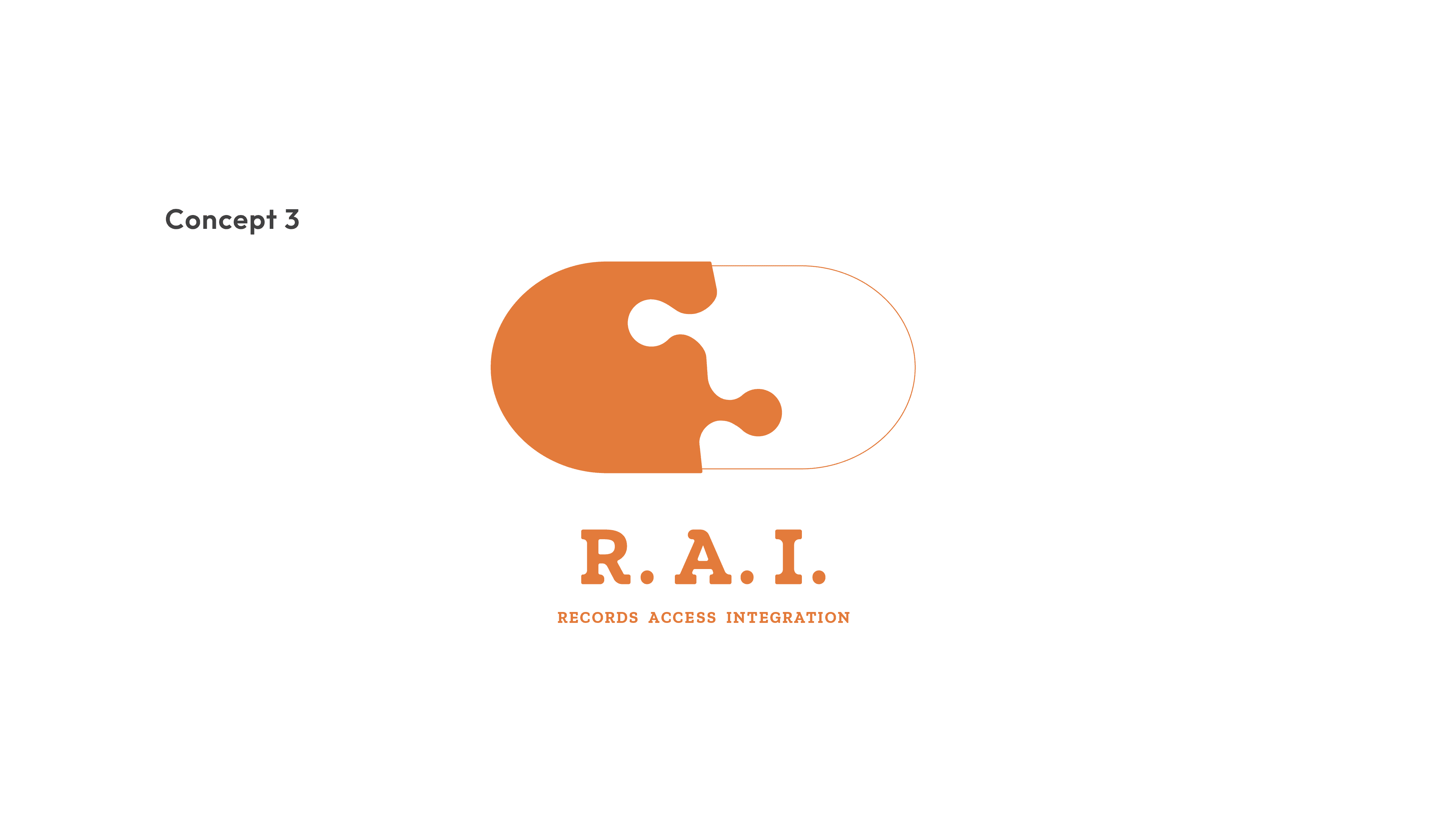
Part of the design process for "RAI" included input from our main pharma sales team. As we asked for adjectives describing what they hoped to see, common industry tropes came out such "white-glove service" and "high level of care."
We developed concept a concept that tightly blended healthcare (DNA) and a bow-tie to speak directly to that team feedback. While it was well-received, the pill puzzle concept continued to generate the most positive feedback.
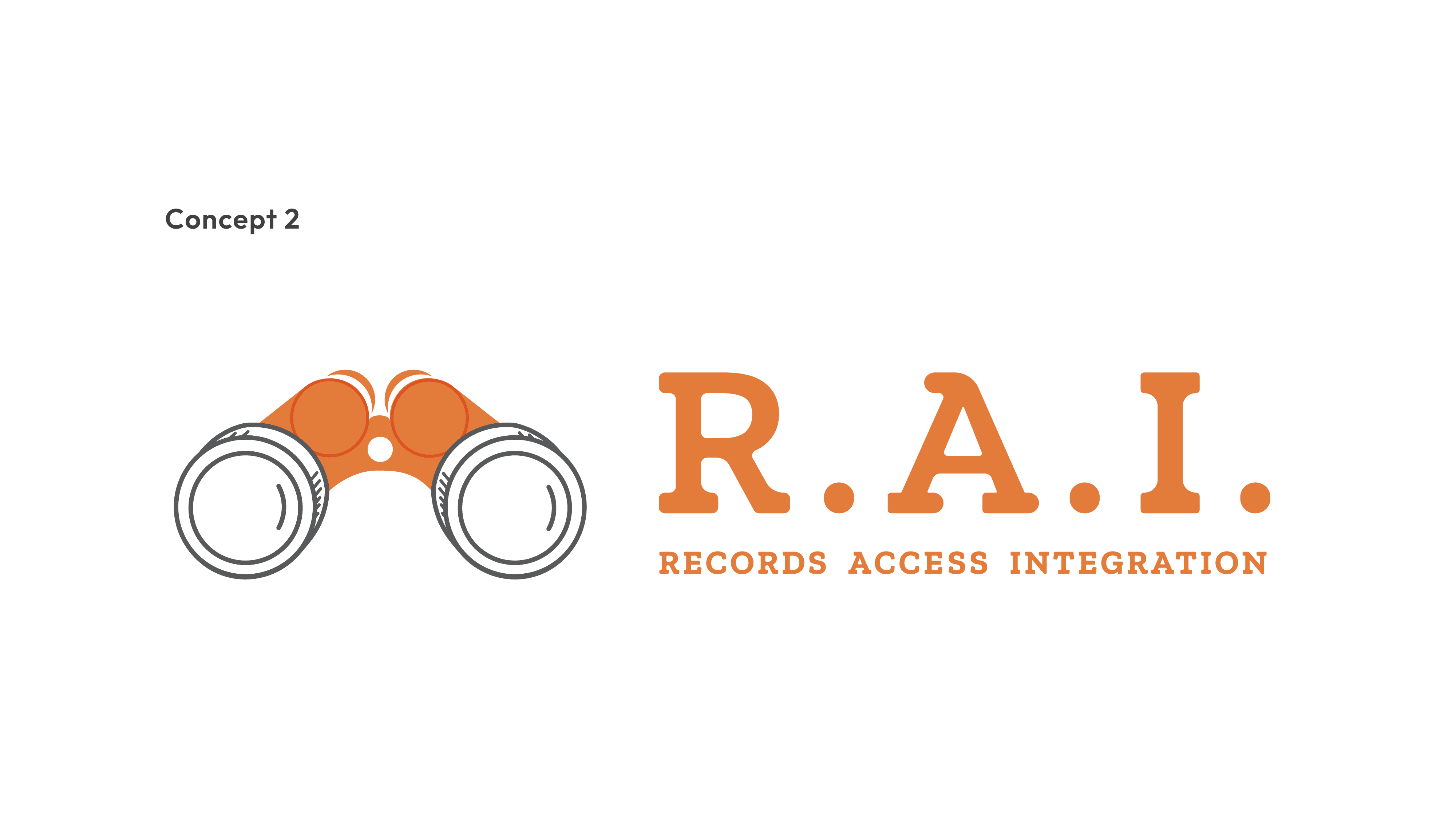
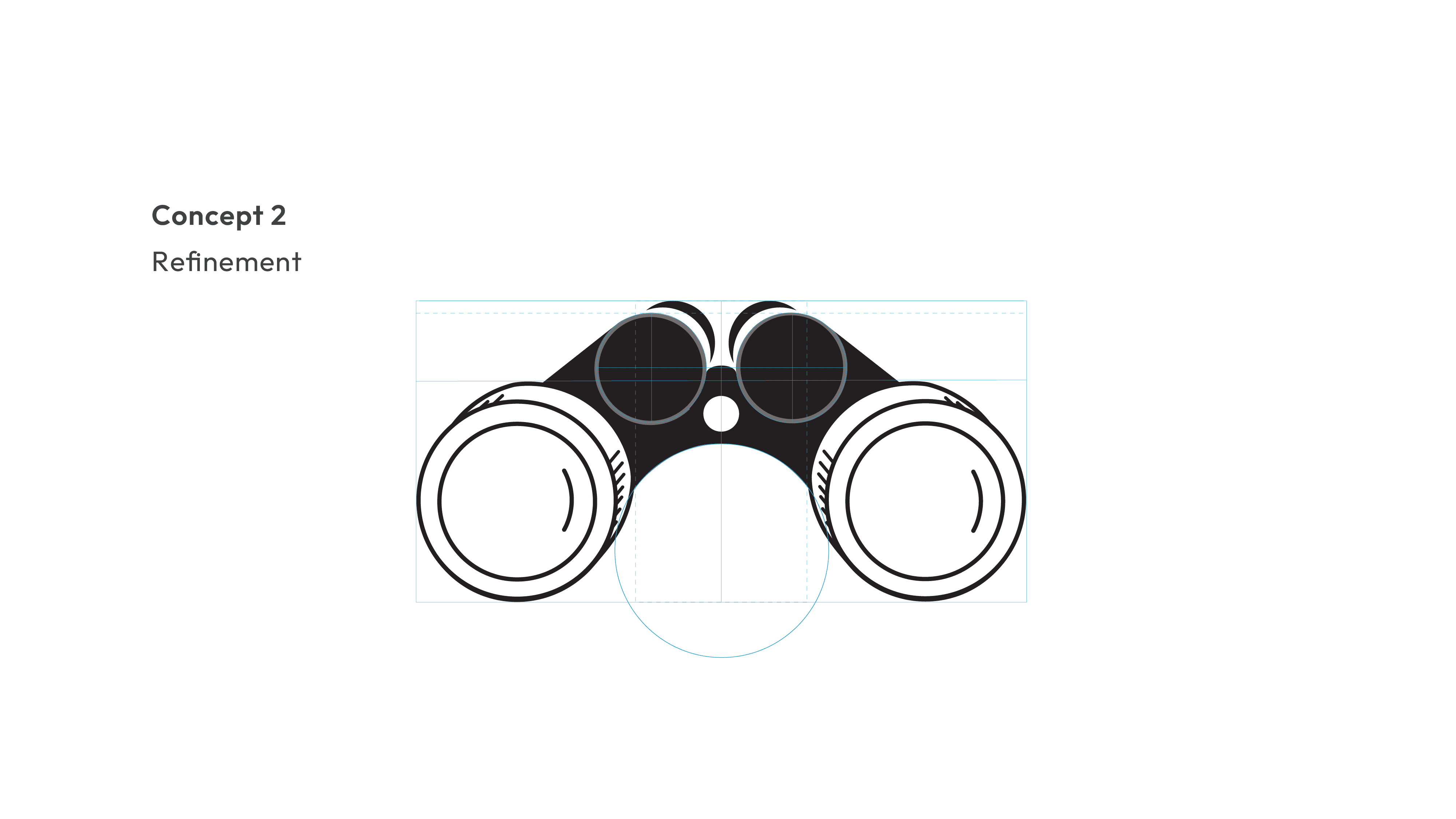
Concept 1 disarmed the perfunctory feedback that is standard in the industry. It was a concept we were prepared to use, but the puzzle concept conveyed most accurately what the service was offering: an innovative connection between two healthcare systems.

year
2019-2026
tools
Photoshop, Illustrator
category
Healthcare Services
01

02

03

04


